Monis Office Builder
An interactive office configurator featuring responsive scene composition, independently positioned workspace elements, and animation-driven interactions.
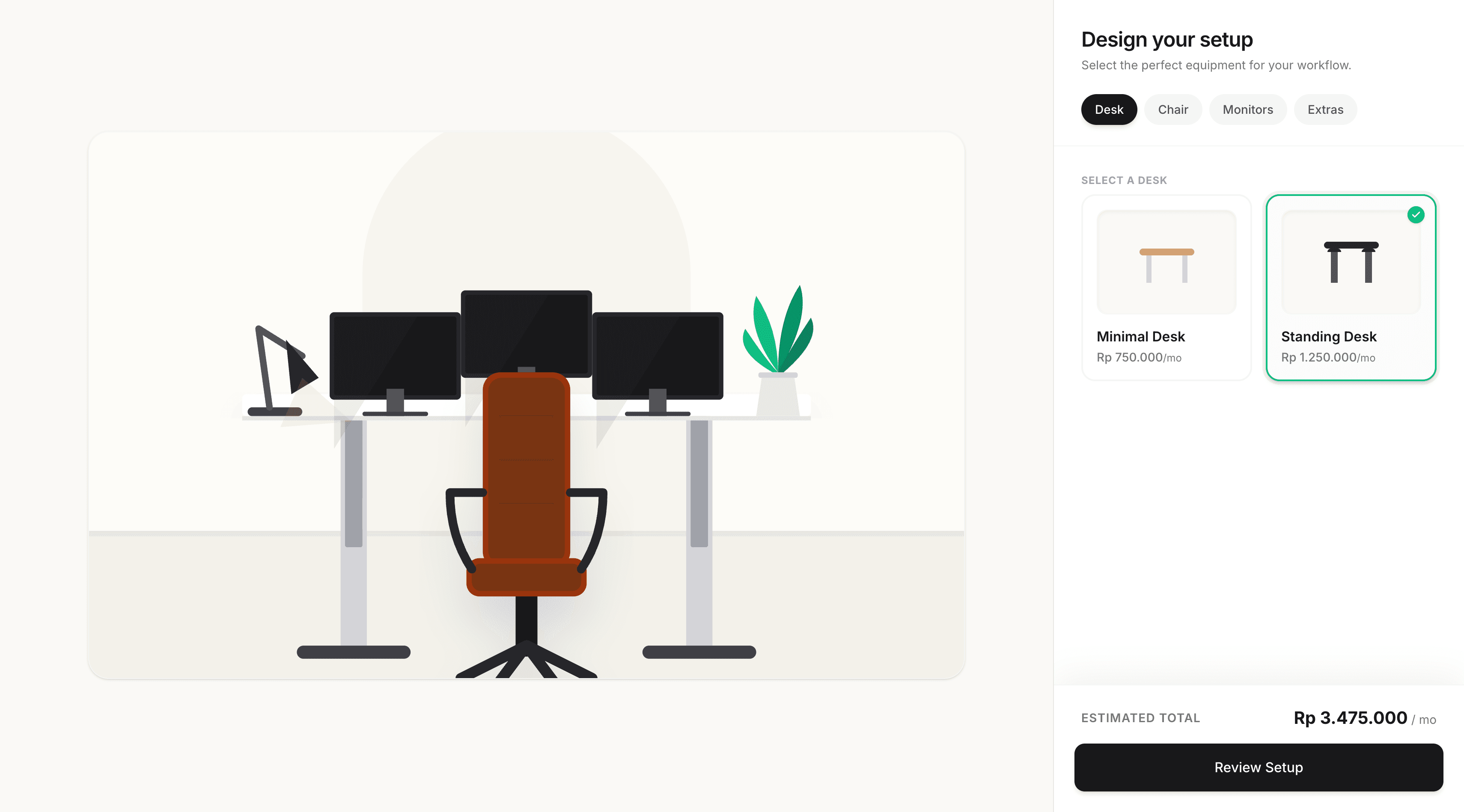
Overview
Monis Office Builder is an interactive workspace configurator created for monis.rent. The application lets users explore and personalize an office setup through a visual, responsive interface rather than relying on static forms or configuration menus. The experience combines reusable UI components, responsive scene composition, interactive desk elements, and animated transitions to make workspace customization feel intuitive and engaging.
The Problem
Traditional office configuration interfaces can feel disconnected from the space being designed, especially when users have to make choices through forms without seeing how those decisions affect the overall workspace. The challenge was to create a visual configuration experience that felt interactive and polished while still remaining responsive, maintainable, and easy to navigate across different screen sizes.
Constraints & Requirements
- The office scene had to remain responsive across mobile devices, tablets, laptops, and larger displays.
- Interactive objects needed to stay correctly positioned relative to the desk instead of relying on fragile screen-level coordinates.
- Focus mode animations had to enhance the desk interaction without breaking the original scene layout.
- The application needed smooth transitions and visual feedback while keeping the component structure maintainable.
- Shared UI and interaction state had to stay predictable across the workspace scene and its individual components.
The Approach
I built the application with Next.js, TypeScript, Tailwind CSS, and Framer Motion, using reusable React components to represent the room, desk, chair, monitors, and tabletop objects. I structured the scene so that individual elements could respond independently to interaction state while still remaining positioned relative to their parent workspace. Responsive sizing was handled with percentage-based layouts and breakpoint-aware styling, while animation logic was isolated to specific components to avoid affecting the overall scene structure.
Key Decisions
- Built the workspace as a composition of reusable scene components instead of a single monolithic interface.
- Kept desk accessories positioned relative to the desk bounds so their placement remained stable across screen sizes.
- Used percentage-based sizing and responsive breakpoints instead of relying on fixed desktop-only dimensions.
- Isolated Focus mode transforms to the desk area so zooming and chair transitions did not distort the rest of the room.
- Used Framer Motion for focused interaction states and transitions while keeping layout responsibilities separate from animation logic.
- Separated scene presentation from interaction state so individual elements could be adjusted without introducing unnecessary coupling.
The Outcome
The finished application delivers a responsive and interactive office-building experience that allows users to engage directly with a visual workspace instead of configuring it through a traditional form-based interface. The project strengthened my experience with responsive scene composition, component architecture, coordinate positioning, shared interaction state, and animation-driven UI behavior in React.
Lessons Learned
- I gained a stronger understanding of how relative positioning and parent-bound coordinate systems make complex responsive interfaces more reliable.
- I learned that animation should be isolated to the smallest relevant component whenever possible, especially when transforms can affect surrounding layout.
- I improved my understanding of how percentage-based sizing and responsive breakpoints can preserve a visual composition across very different screen sizes.
- The project reinforced the value of separating scene structure, interaction state, and animation logic when building highly interactive interfaces.
- I learned that fixed pixel positioning can work for local offsets, but becomes fragile when it is used as the foundation for an entire responsive layout.
- If I were extending the project further, I would make more of the workspace configuration data-driven so new furniture, accessories, and layout options could be added without changing the scene architecture.